Modular Elegance
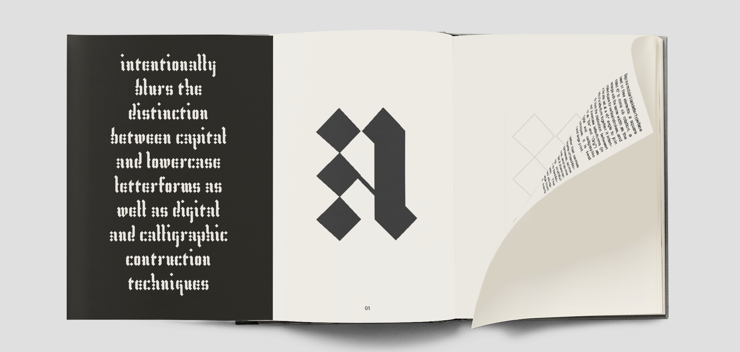
Elegy’s introduction begins with an animated “logo” that showcases the kinetic energy and formal ambiguity of the typeface. The typeface’s modular system is based on a set of fundamental units—rotated squares (diamonds), diagonal lines, and rectangles—allowing for flexible construction of letterforms that often blur the distinction between upper and lowercase. This dynamic interplay between forms is exemplified in the letters “g” and “y,” which, while sharing similar structures, remain distinguishable through subtle shifts in orientation and design details.
Elegy’s conceptual foundation is rooted in blackletter’s medieval traditions but recast in a modern, modular grid. This design process draws inspiration from Albrecht Dürer’s blackletter experiments, stripping away extraneous rules to create a more distilled, minimalist system that still retains its decorative essence.


Gravitas in Motion
The application of Elegy in posters and motion banners demonstrates its capacity to evoke both historical gravitas and contemporary edge. The posters juxtapose ecclesiastical language with modern themes, such as environmentalism, creating a dialogue between tradition and progress. Diamond-shaped fold lines on the posters mirror the modular forms of the typeface, creating a visually cohesive experience that plays with the visual motifs established in the letterforms. The motion banners, which feature excerpts from Shakespeare’s The Tempest, pay homage to the Italian gravestone engravings that inspired the typeface’s name. By rotating and animating the letterforms around a rectangular frame, the banners echo the circular walking paths of mourners in old Italian cemeteries, adding a kinetic, almost ritualistic dimension to the typeface’s usage.


Typographic Rituals
The specimen book extends Elegy’s typographic exploration into a more formal presentation, highlighting the nuances of the typeface through sample phrases, pull quotes, and technical details from the font design process. While purely conceptual, the mock-up of the specimen book presents the typeface as a finished, polished product, offering insights into its construction and potential applications. Lastly, the static banners that began the project encapsulate the typeface’s essence—ritual, mourning, and a reverence for history—while also demonstrating how a modular, modern blackletter can breathe new life into classic texts. The banners serve as a final reflection on the personal significance of this project, inspired both by artistic tradition and personal loss.