H-LAB

Sub-Brand Identity
User-Generated Design
Culture Jamming

Overview

“H-LAB” is an imagined, digital-forward sub-brand of Huntington that investigates how the institution can engage with audiences who may not typically be drawn to cultural preservation spaces. H-LAB shifts the focus away from celebrating Huntington’s physical collections and exhibitions to emphasize digital interactions, remix culture, and creative takes on classic subjects. This sub-brand encourages online visitors to explore the institution’s digital archives, while also inviting in-person visitors to engage in creative reinterpretations of Huntington’s historical materials. Visually, H-LAB intentionally contrasts with Huntington’s structured identity, emphasizing fluidity, asymmetry, and a sense of playfulness that reflects the remix culture it seeks to cultivate.

H-LAB Widget
H - L A B

Fluidity in Motion

The H-LAB logo generator exemplifies the dynamic and fluid identity of this sub-brand. By allowing each character of the logo to stretch, condense, or shift independently, the generator highlights the experimental nature of H-LAB’s visual language. This interactive widget invites users to manipulate the logo’s form, reinforcing the sub-brand’s ethos of creative freedom and reinterpretation. Each element of the logo becomes a gesture, a visual response to the ever-evolving nature of digital interactions. The variable nature of the logo, where each letter can take on a unique width, not only reflects the flexibility of H-LAB’s identity but also creates a metaphor for the institution’s content—each aspect (library, art, botany) can be emphasized or downplayed depending on the user’s focus.

5
7

Pixels in Play

This generator takes the brand’s emphasis on digital culture a step further, allowing users to create asymmetrical pixel formations that represent the idea of “remixing” Huntington’s classical collection in real-time. The pixel formations serve as a metaphor for digital disruption—disjointed, random, yet visually cohesive within the flexible structure of the H-LAB identity. Users can adjust parameters such as the number of rows and columns, effectively becoming co-creators in the design process. The introduction of asymmetry challenges the rigid, tile-based aesthetic of Huntington’s main brand, positioning H-LAB as its digital foil. Through this playful interaction, users are invited to engage with the idea of pixels as building blocks of digital art, in contrast to the physical, tactile materials of Huntington’s historical collections.

Remixing the Classics

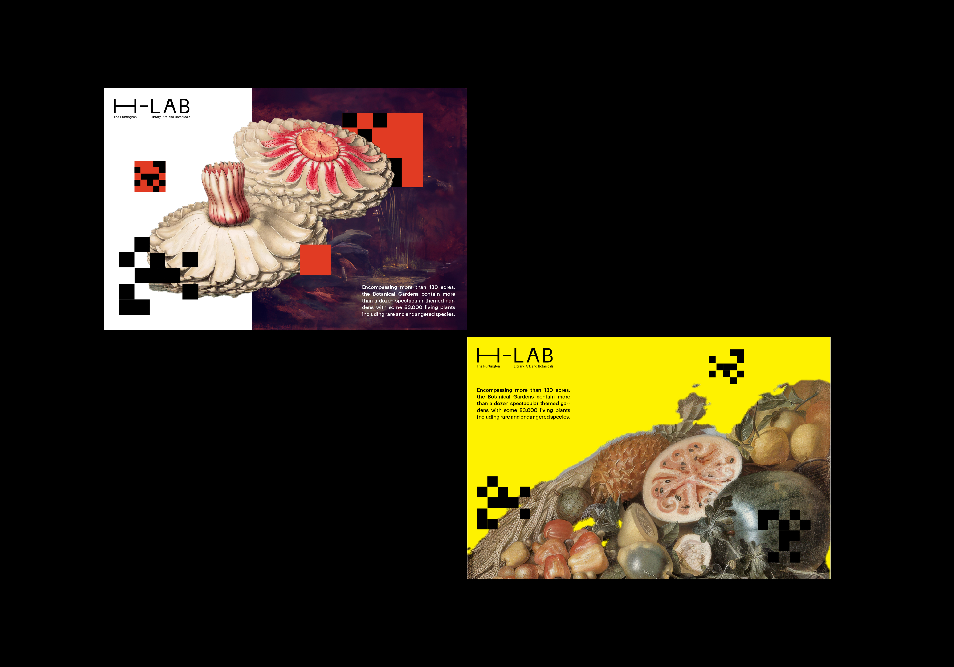
The H-LAB postcards showcase the sub-brand’s approach to remix culture by blending archival imagery with digitally generated pixel arrangements. These print collateral pieces merge the historical with the modern, inviting viewers to see Huntington’s materials in a new light.

Meanwhile, in the imagined workshop-produced images below them, H-LAB’s core mission of interactive, visitor-led creativity comes to life. The fictitious workshop invites participants to apply randomized pixel arrangements to archival drawings, creating new art from classic materials. The application of gradient maps and blending modes adds a digital aesthetic to the classical drawings, symbolizing H-LAB’s effort to bridge the gap between past and present. By reimagining these historical pieces through contemporary techniques, the workshop reinforces the sub-brand’s goal of making Huntington’s offerings more accessible and engaging to younger, more diverse audiences.

Creative Disruptions

The H-LAB posters extend the sub-brand’s playful, experimental approach to typography and visual design. Fluid, gestural typography takes center stage, emphasizing the idea of flexibility and creative expression. These posters, which remix imagery with gradients, blending modes, and pixel arrangements, serve as a call to action—inviting visitors to engage with the digital collection and make it their own. The asymmetrical arrangements create a visual disruption that mirrors H-LAB’s role as a contemporary counterpoint to Huntington’s more structured identity. These posters are not just advertisements but representations of the potential for creativity and reinterpretation within the institution’s collections.

Spatial Interventions

H-LAB’s ability to create disruption within physical spaces is demonstrated through its spatial application of the variable width logo in Huntington’s Virginia Steele building. Here, the logo exhibits the function-driven behavior of emphasizing the "A" over all other letters of the logotype as a signifier for this experience. This “pop-up” moment is designed to provoke thought and challenge the typical gallery experience, adding a layer of contemporary commentary within a historical context. By positioning H-LAB’s fluid identity alongside the institution’s more rigid and formal displays, this spatial intervention underscores the sub-brand’s mission of engaging visitors in new, unexpected ways. The juxtaposition of a variable, digital-first logo with a historical space reflects the tension and dialogue between past and present, central to the ethos of H-LAB.

Huntington

Generative Identity System

H-LAB

Experimental Identity Design

BLOOM

Site-Specific Event Identity

BC / AD / AI

Multimedia Editorial Design

Elegy

Modular Font Design

GameStop

Motion Identity System