


Hyped in Motion
The foundation of BLOOM’s visual identity lies in a modular typeface, heavily influenced by electronic music culture and underground rave posters. This custom typeface echoes the dynamic nature of the event itself—its strict geometry and radial corners suggest structure, while the thin, connective lines create a sense of movement, invoking the fluidity of digital interactions. This same approach informs the visual experiments with blob tracking, where videos of blooming flowers are abstracted through real-time processing techniques. The resulting glitch-like movements of flowers dissolving into digital forms mirror the conceptual goals of the event, bringing the ideas of transformation and infinite space into the visual identity. These visual experiments served as the backbone for much of the print collateral and event promotions.


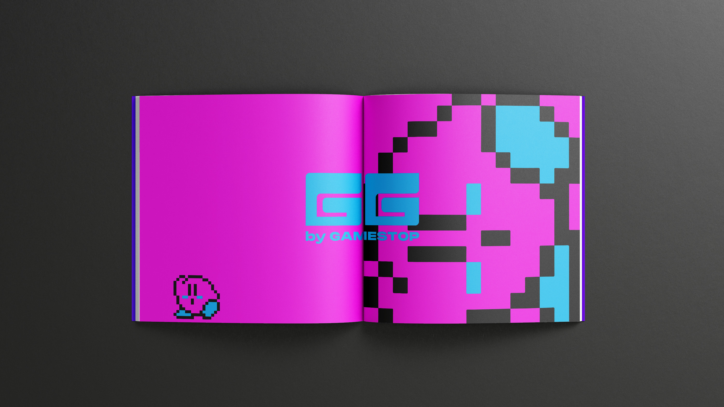
Immersive Playgrounds
"GG by GameStop" extends beyond visuals to reshape GameStop’s physical spaces, transforming them into immersive environments where community and competition thrive. The designs for flagship locations and eSports arenas are inspired by the balance of spectacle and intimacy found in great game worlds, creating spaces that are both electrifying and welcoming. Whether hosting large-scale eSports events or providing cozy corners for casual players to connect, the spatial environments are designed to foster a sense of belonging and excitement. These physical locations further GameStop’s evolution into a social gaming hub, offering players of all levels a place to engage with their passion in a shared space.


Tactile Tech
The collaboration with Logitech adds a tactile dimension to the brand, focusing on products that align with the values of “GG by GameStop.” Packaging for gaming headsets and accessories echoes the visual identity’s retrofuturistic style, while ensuring functionality and clarity. These product designs help reinforce GameStop’s focus on user-friendly and stylish equipment that supports the gaming lifestyle. By creating a cohesive product line, “GG by GameStop” merges hardware with brand identity, ensuring that every touchpoint—from packaging to product usage—reflects the brand’s vision of modern, competitive gaming.


Unified for Victory
To extend the brand’s reach into the world of competitive gaming, “GG by GameStop” conceptualizes an official eSports team. The uniforms feature the same bold, dynamic aesthetic as the rest of the brand, using clean lines, striking colors, and performance-focused design to unify the team visually. These uniforms go beyond functional gear; they embody the brand’s values of inclusivity and community, fostering a sense of pride and connection among the team and its supporters. By introducing a unified team look, “GG by GameStop” further establishes itself as a central figure in the competitive gaming space.


Codifying the Culture
The foundation of BLOOM’s visual identity lies in a modular typeface, heavily influenced by electronic music culture and underground rave posters. This custom typeface echoes the dynamic nature of the event itself—its strict geometry and radial corners suggest structure, while the thin, connective lines create a sense of movement, invoking the fluidity of digital interactions. This same approach informs the visual experiments with blob tracking, where videos of blooming flowers are abstracted through real-time processing techniques. The resulting glitch-like movements of flowers dissolving into digital forms mirror the conceptual goals of the event, bringing the ideas of transformation and infinite space into the visual identity. These visual experiments served as the backbone for much of the print collateral and event promotions.